PepsiCo, the company behind everything from Doritos to Gatorade, just hit refresh on its entire identity, and it’s nothing like what you’d expect from the maker of one of the world’s most recognizable sodas.
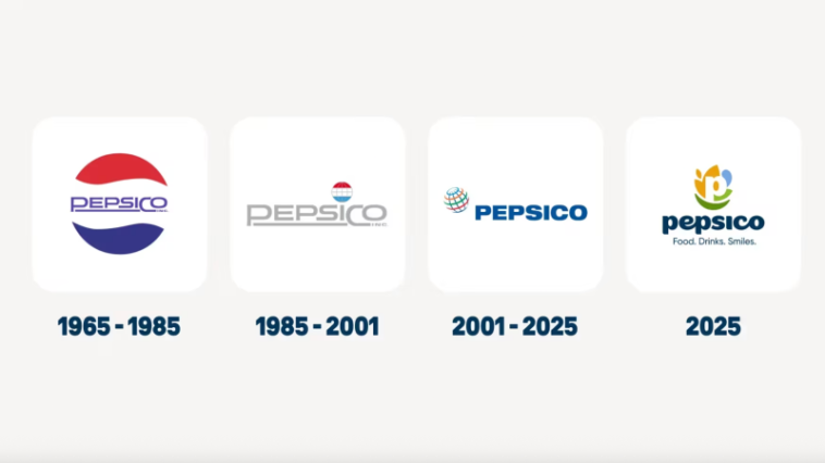
The new look, revealed this week, is practically unrecognizable. It is the company’s first full rebrand since 2001, and it signals a major shift in how PepsiCo wants the world to see it. Gone is the corporate logo that leaned heavily on Pepsi’s red-and-blue design. In its place is something far more abstract — and far more intentional.
The new logo features a lowercase “p” surrounded by colorful organic shapes. Each piece, according to PepsiCo, represents a different part of its business. A burnt yellow shape stands for food and grains. A light blue form nods to drinks and water. A green leaf represents sustainability and health. And a forest-green smile tucked below the “p” symbolizes its focus on consumers.
The tagline, “Food. Drinks. Smile.”, ties it all together, written in a custom curvy typeface meant to feel more approachable and “human.”
The design isn’t just a visual update, but it’s a statement. For decades, PepsiCo’s corporate identity was built around Pepsi itself. But today, PepsiCo is a $260 billion behemoth with over 500 brands under its wing. When the last logo launched in 2001, it had just 13.
This rebrand is PepsiCo’s way of saying it’s no longer just the company behind a cola. It’s an entire ecosystem of snacks, beverages, and increasingly better-for-you products.
In the past few years, PepsiCo has been quietly reshaping its portfolio around health and wellness trends. It bought the grain-free chip brand Siete Foods for $1.2 billion, the prebiotic soda Poppi for $1.65 billion, and it’s preparing to roll out its own prebiotic cola this fall. It’s also reformulating classic lines like Lay’s and Tostitos to remove artificial colors and flavors by the end of the year.
During the company’s latest earnings call, CEO Ramon Laguarta pointed out that American consumers are far more health-aware than they were even five years ago. He said PepsiCo plans to ramp up protein beverages and focus on affordable serving sizes to appeal to shoppers with tighter budgets.
On the surface, the new identity might look like a collage of random blobs. But it’s doing something PepsiCo’s old branding couldn’t, detaching the company from Pepsi itself.
Despite its global presence, only 21 percent of consumers can name another PepsiCo brand beyond Pepsi. That stat alone explains why the company wants to draw a hard line between the corporate name and the soda brand.
Now, the new logo looks more like it belongs on a wellness startup or a sustainability campaign than a soda can, and that’s the point. PepsiCo wants to project an image that fits its future – cleaner, greener, and broader than its sugary past.
Designers are split. Some say the new look feels safe and corporate — too abstract to connect emotionally while others think it’s exactly what a global food empire needs – it's flexible, universal, and easy to adapt across 500 products that have nothing to do with each other.
Either way, the message is clear. PepsiCo doesn’t just want to refresh its logo but it wants to refresh its identity. And for the first time in decades, it’s doing so without hiding behind a bottle of soda.
Source: Fastcompany

