Domino’s Pizza is shaking things up! For the first time in more than a decade, the iconic chain is rolling out a full brand refresh that goes beyond new colors and packaging. What’s especially daring about this reboot? Domino’s is debuting its first-ever brand jingle, recorded by Grammy-nominated artist Shaboozey. Read on to get the inside scoop on the overhaul and what it means for the pizza chain’s future.
Domino’s gets a makeover — and a catchy new tune to match
Domino’s Pizza is serving up something fresh — and this time, it’s not just what’s coming out of the oven. For the first time in 13 years, the pizza giant is unveiling a full brand refresh designed to make every slice of the Domino’s experience as craveable as its signature pies. Inspired by the brand’s legacy and reimagined for the modern era, the refresh blends nostalgia with bold, contemporary flair. From a new sound and look to fresh packaging and design elements, Domino’s aims to capture attention in every bite, every click, and every order.
At the heart of this transformation is the debut of its first-ever jingle, “Dommmino’s”, performed by five-time GRAMMY nominee Shaboozey, giving the brand a voice as memorable as its flavor. The updated look and feel will soon appear across the U.S. and international markets, spanning TV and digital ads, pizza boxes, uniforms, store décor, and Domino’s digital platforms.
Here’s a closer look at the key updates in Domino’s craveable brand refresh:
- Eargasmic “Cravemark”: Instead of a typical tagline, Domino’s introduces a new audio and visual signature — a playful “Dommmino’s” sound designed to stick in your head. The catchy tune, brought to life by Shaboozey, represents the joy and togetherness that pizza brings.
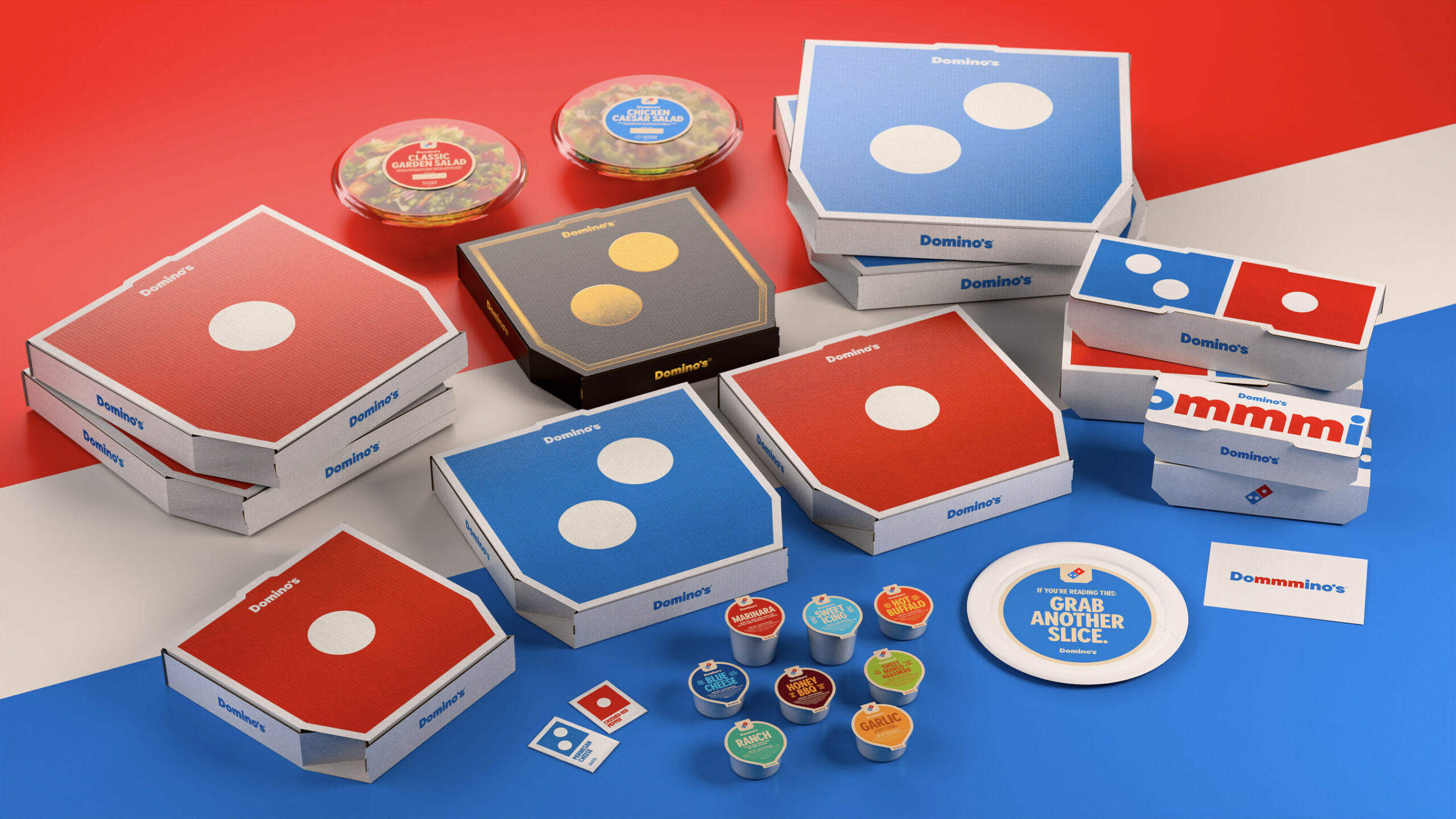
- Brighter, Bolder Packaging: The new box designs spotlight Domino’s iconic logo in a clean, eye-catching layout. Premium pizzas like the Handmade Pan and Parmesan Stuffed Crust varieties get a luxurious upgrade with black-and-metallic-gold packaging for an indulgent touch.
- Hotter Colors: Domino’s retains its classic red and blue but amplifies them into more intense, “oven-hot” shades, symbolizing freshness and flavor straight from the oven.
- Typeface (“Domino’s Sans”): The brand debuts a thicker, rounder, and more “doughy” custom font inspired by pizza shapes — full of warmth, character, and personality.
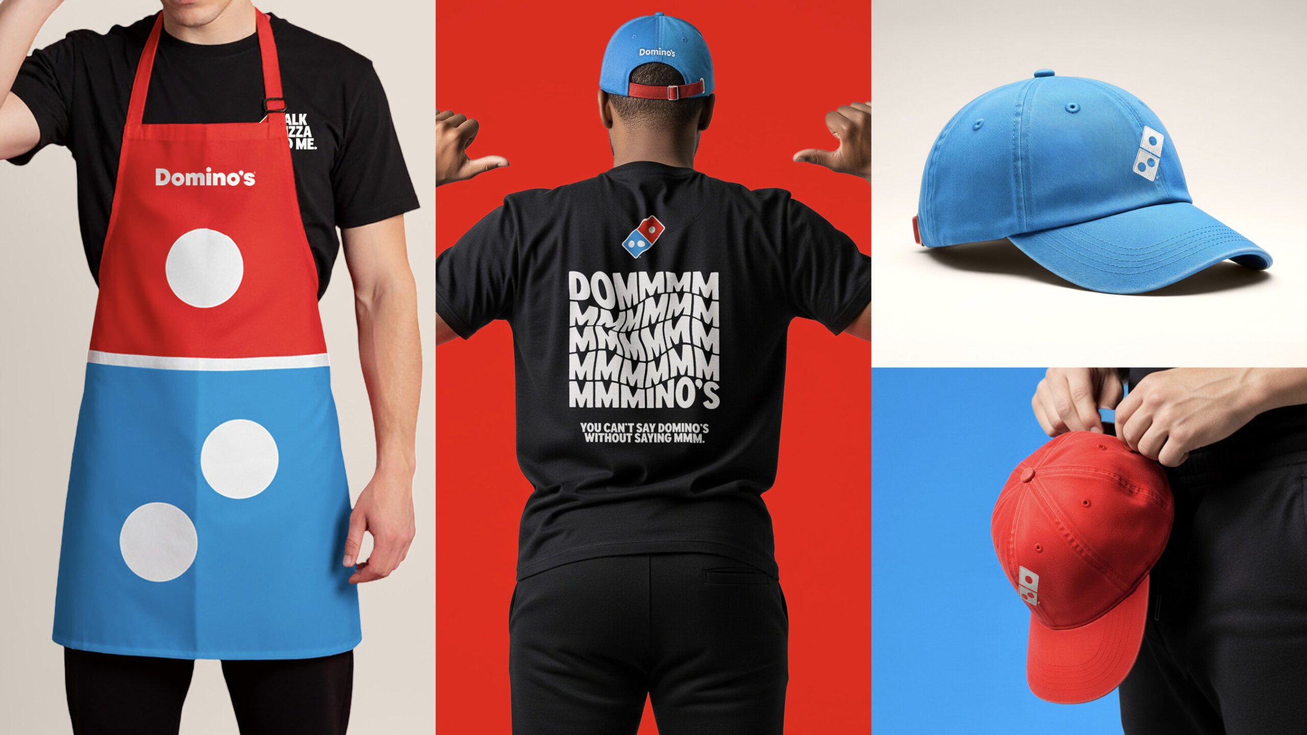
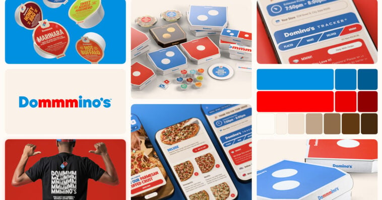
- Digital and In-Store Vibrancy: Domino’s website, app, and in-store visuals now feature a more energetic design, supported by refreshed team uniforms and updated print materials that reflect the brand’s youthful, modern spirit.

Why Domino’s hit the refresh Button
Domino’s Pizza is undertaking its massive brand overhaul not from a position of weakness, but one of continued ambition. After spending years building a reputation as a dominant tech company in the food space, the new strategy is to shift the spotlight back to the core product: delicious pizza. This “tech company” reputation stemmed from its pioneering digital focus, developing industry-leading innovations like the Pizza Tracker, “AnyWare” ordering across various platforms (from smartwatches to social media), and proprietary back-end systems (like DomOS) that drove over 65% of its sales through digital channels. The refresh is about reaffirming the company’s identity as a pizza-first brand.
Explaining the pivot, Kate Trumbull, Domino’s executive vice president – global chief marketing officer, stated that the goal is to bake the joy of eating right into the brand itself:
“Over the past decade, we became known as a technology company that happens to sell pizza,” said Kate Trumbull, Domino’s executive vice president – global chief marketing officer, in a press release announcing the brand refresh. “But with our Hungry for MORE strategy, we’re bringing the focus back to making and delivering the most delicious products and experience, which is what Domino’s customers really want. Rather than launching a more traditional tagline, we’re baking craveability right into our name and every aspect of our brand as a reminder of this relentless focus. You literally can’t say ‘Domino’s’ without saying ‘mmm.'”

Trumbull emphasized that the refresh isn’t a reaction to poor performance, but a drive for continuous improvement and a desire to embody the fun of pizza:
“Most companies rebrand themselves when they’re struggling, but after years of category-defying growth, this refresh is about continuing to push to be the best version of ourselves,” added Trumbull in the press release. “It’s vibrant, it’s bold, and it’s fun. It’s pizza!”
Mindful of recent corporate rebranding missteps—like the one experienced by Cracker Barrel—Domino’s rigorously tested all elements of the new look and sound. The company relied on extensive consumer research to ensure the changes resonated with customers and avoided alienating loyal users. Trumbull confirmed the essential role of customer feedback:
“Whether it’s light Domino’s customers [or] heavy users, we’re listening to everyone and seeing how they interpret what we’re doing and making sure that it’s a value add,” she said in an interview with Nation’s Restaurant News. “And there were things we looked at for this brand refresh that we didn’t end up doing because we listened to consumers.”
Sources: Domino’s Pizza, Nation’s Restaurant News


